London Advertising
Distinctive, bold, memorable – yet always sympathetic to the work on show. A visual identity that can stand on its own or provide a compelling insight into individual projects.
Client: London Advertising
Project Type: Logo design; art direction; pitch & presentation design
-
London Advertising is an award-winning agency based, unsurprisingly, in London. Coming out of the pandemic, the agency wanted to revaluate their own visual identity as they approached a new roster of clients and we were happy to help!
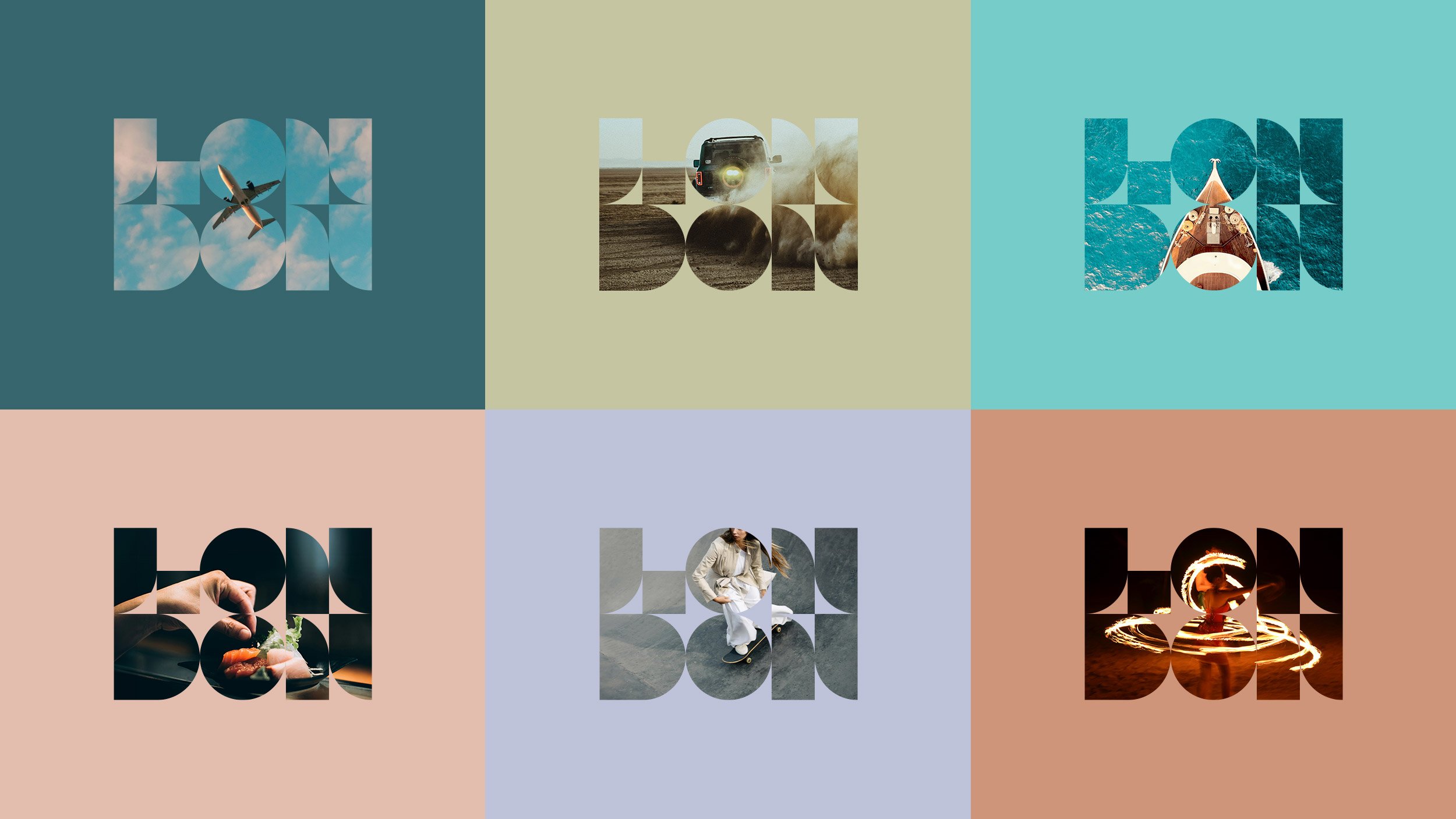
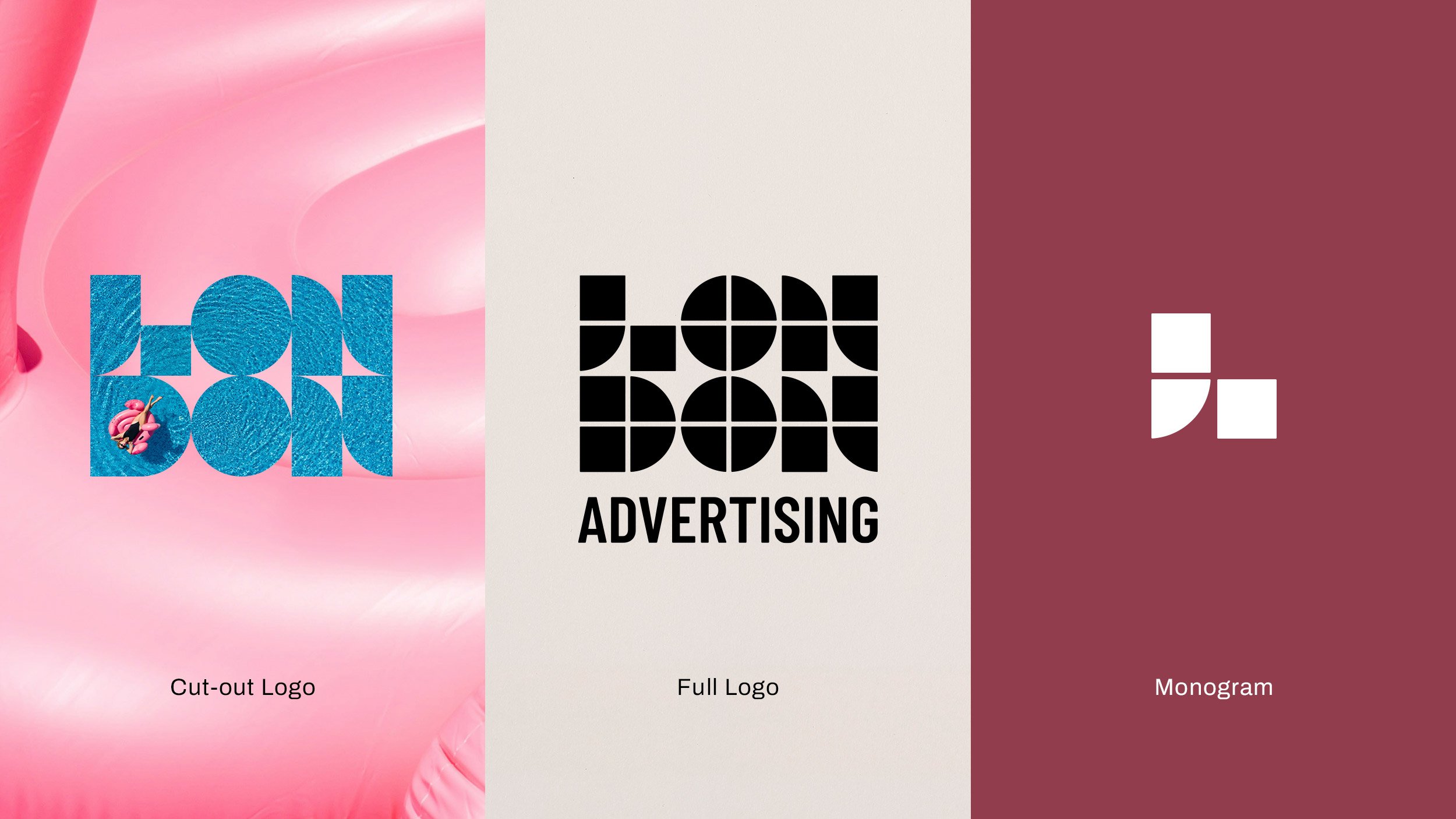
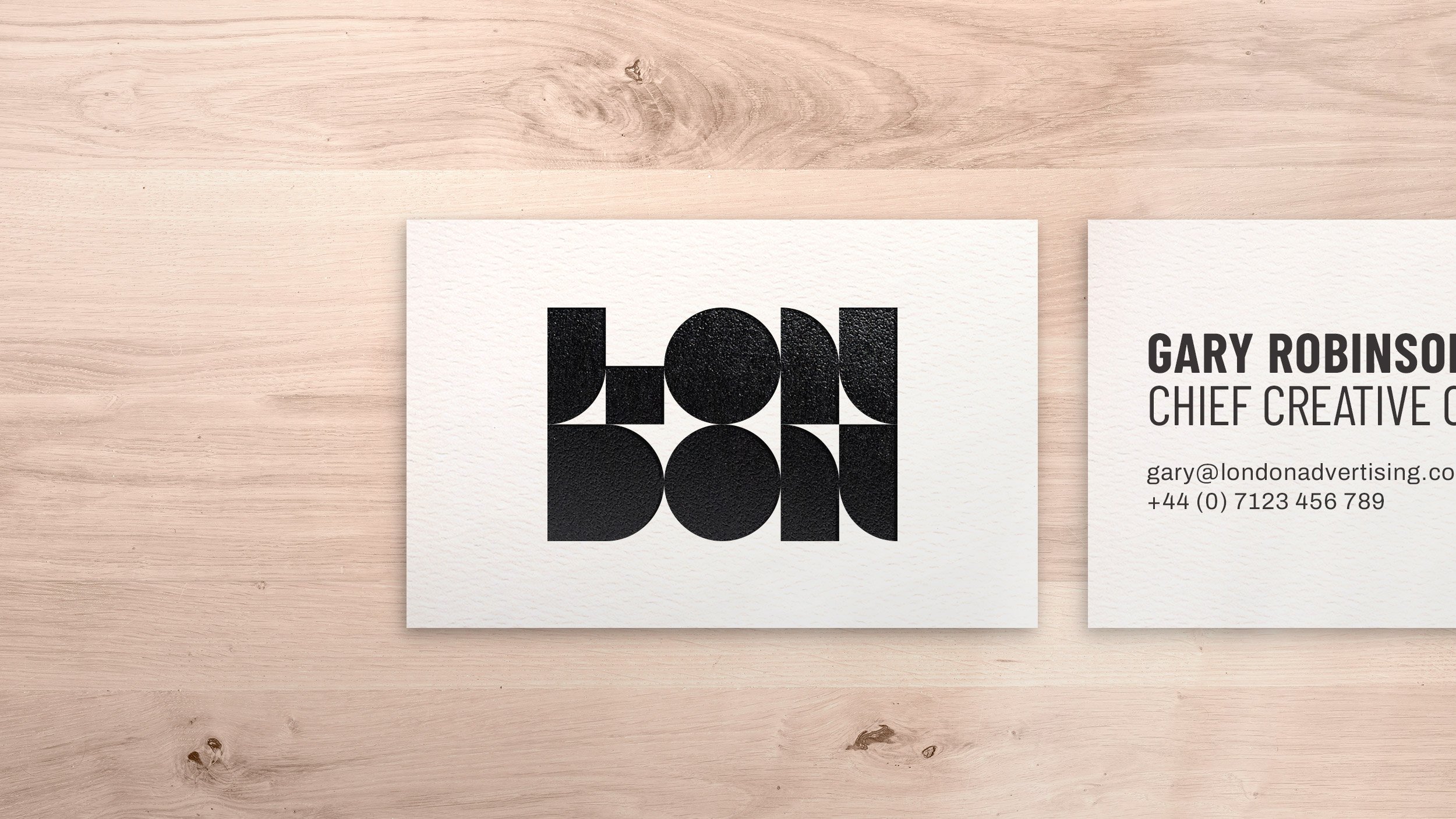
Generally speaking an agency’s branding should be distinctive and memorable yet shouldn’t ever fight with the ideas or work being presented. As such, the logo we developed is simple and bold, constructed from two geometric shapes (a square and a quarter circle) that work together as a recognisable brand mark and as a container for photography.
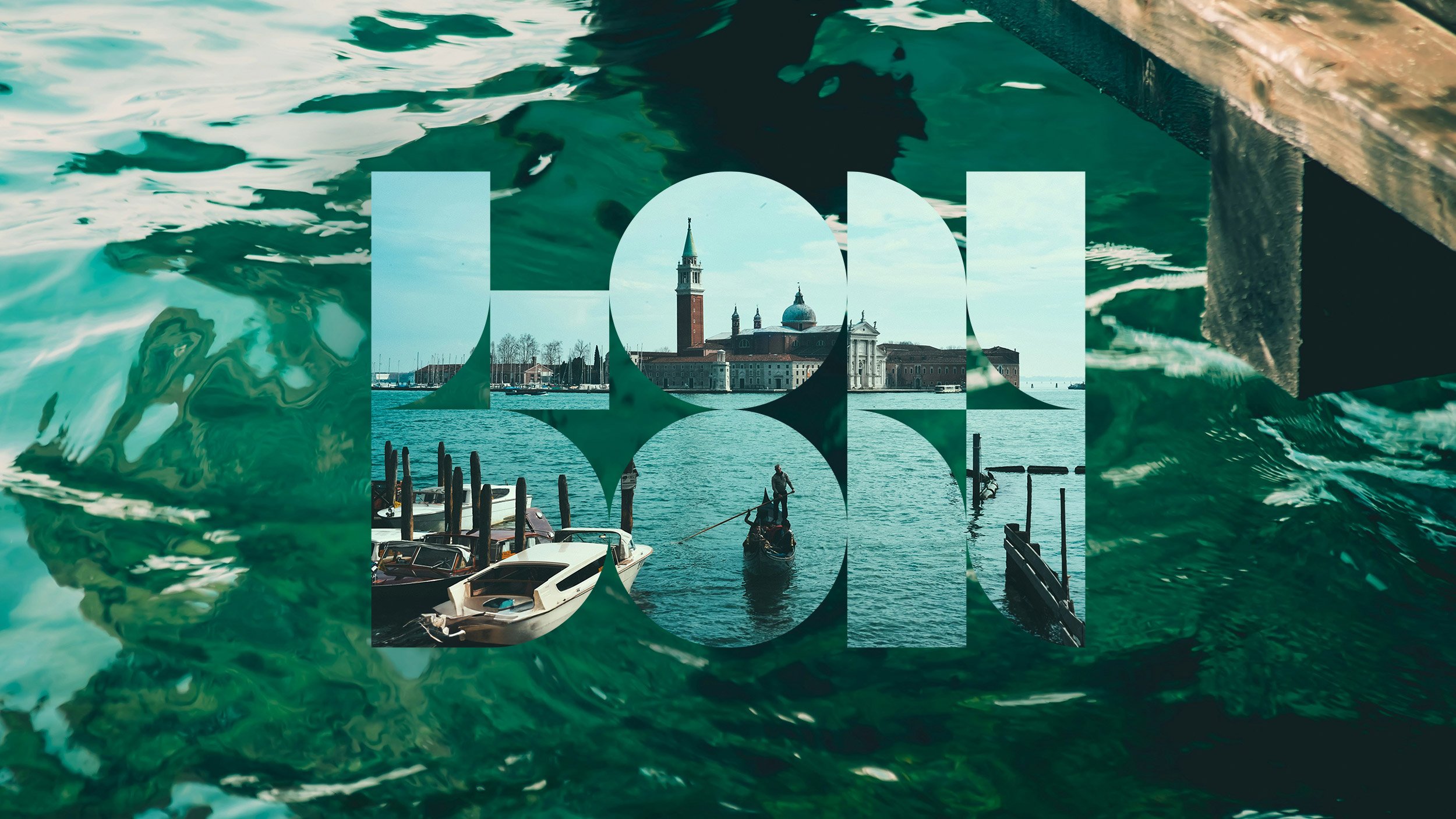
This device has beome a visual calling card for the agency across video, presentations and online. When used, the subtlety of this device can be dialled up or down depending on its intended use; a plain colour could be used to help enhance the image inside the logo, or a second background image could be used to help tell the story, providing additional context or helping to convey the mood of the campaign or project.
The logo can be broken down into its component parts for decoration with individual shapes, or groups of shapes, used to house smaller images or act as colour or pattern overlays.
The shapes can also be enlarged and used as a layout device within pitches and presentations – creating a simple yet consistent visual link across the identity.
Elsewhere in the identity, supporting typefaces have been chosen to contrast with the blocky logo and the colour palette is restricted to black, white and grey tones. Any additional colour is derived from the project imagery, again so that the branding enhances the work rather than detracts from it.

